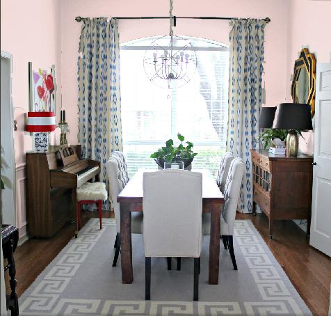
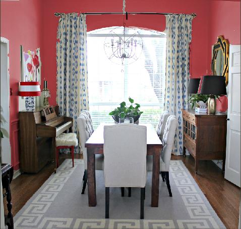
Adding the drapes was a huge update for the Dining Room, but I've been saving the biggest change for last...painting the walls and ceiling! Since the ceiling is 14-feet high, I knew I'd have to hire it out. (This girl and the top rung of a ladder don't mix!) But most of the delay has been because of my indecision on the color.
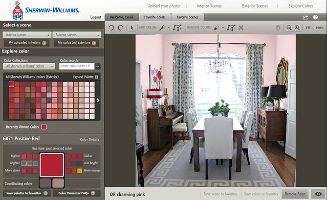
If you recall the Mood Boards, the plan all along has been a pale, glamorous, sophisticated pink. I just had no idea it was one of the hardest colors to find! I don't want baby nursery pink, or purpley pink, or the worst option...fleshy pink. Thank goodness for the Sherwin-Williams Color Visualizer.
You're able to upload any picture, then waste an entire afternoon playing with potential paint colors! It is so helpful to actually picture it before you paint it. The tools are super simple...you select from their vast rainbow of colors, and just drag and drop!
Granted, there are fluctuations in computer monitors, but 'Innocence' had been my front-runner until I saw how bubble gum it looked in my room.
Same was true for 'Possibly Pink,' which I discovered had too much purple. I was able to eliminate other shades of pink as well because they were too 'Silence of the Lambs' (fleshy, skin-tones...ick).
Keep reading to place your vote, and be entered to win $100 Sherwin-Williams gift card!
It appears we may have a winner with 'Verbena,' which has a nice blend of warm and cool tones. (Does that even make sense? I think I just made that up.)
As long as I was playing, I figured I'd see if pink was indeed the right choice...so, here's how the room looks with a dark and moody color, like 'Black of Night.'

Not bad, but my jaw hit the floor when I saw 'Showstopper' in action. I'd have never considered painting it red...nor would I know how great it would look... without the Sherwin-Williams Color Visualizer!
As much as I love the red walls, I'm not sure how they'd relate to the adjoining rooms. The Entrance Hall and Living Room have red accents, but saturating the walls in the intense color might be too much. But, obviously, this tells me I'd like some boldness in here, so why not try it out on the ceiling? Here's where you guys come in.

I absolutely love getting your input...and you've never been shy about dishing your opinions. So what say you...
A) Walls: Pale Pink & Ceiling: Red
B) Walls: Red & Ceiling: Pale Pink
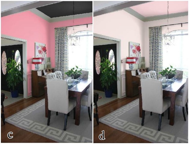
C) Walls: Darker Pink & Ceiling: Dark Gray
D) Walls: Pale Pink & Ceiling: Darker Pink
E) None of the above...girrrrl, you've lost your mind!
B) Walls: Red & Ceiling: Pale Pink
C) Walls: Darker Pink & Ceiling: Dark Gray
D) Walls: Pale Pink & Ceiling: Darker Pink
E) None of the above...girrrrl, you've lost your mind!
Which color option do you choose?
0 comments:
Post a Comment